Tuesday, 26 August 2014
Documentation
All of my footage was filmed over the duration of two days. I first took still images of Brooke in my garden posing and rotoscoped each image to either put over the footage or have them flashing between each image. On the second day I then filmed the live footage of brooke dancing on Castle hill. Most of my time is used to rotoscope and overall i have completed 2 minutes but took me over 16 days to rotoscope.
Written interpretation
For my video, considering it is a music video I don't have a script for my piece. All of my animation is live footage or rotoscoped images over a piece of music which i have composed/sung myself. Instead of planning my my video i have filmed bits and pieces which i have tested by putting the footage into PS and rotoscoped then stringed the pieces of film together.


Initial Planning
For my Animation video I have decided to compose a music video. I've decided to do this because although I already have completed all of the character design for 'dizzy'; the animation as a cartoon television programme would have become boring. The video will be created by using rotoscoping on still images and live action footage. I thought that if i were to combine the two it could create an interesting effect when two images are superimposed. The piece that I am planning will be abstract so that the viewer can have their own take of the video rather than making it my own. The video will start with a girl laughing and almost narrate her life through the camera. Small bits of her clothing, facial features and hair will be rotoscoped. As the video goes further on the rotoscoping of each shot will increase until eventually the girls is dancing on a hill with rotoscoping flashing around her.
Tuesday, 6 May 2014


Tuesday, 29 April 2014
Combining elements to create characters
Picture collage

 The idea of smoke and the way it moves inspires me to use it to emphasise the smoke and prove to the viewers that it is bad but by making it bright colours will also give the viewer an idea that it is not smoke and something else. So by using the colours I will draw the attention away from what it actually is and draw the viewers attention to the colours rather than the smoke.
I origionally wanted to have the style of little mermaid and do this within photoshop frame by frame. It will take alot of time but eventually it will be worth the time and effort. I like how the little mermaid is designed because it is so simple with black lines and block colours but is also shows an interesting, bold image for the viewers. The character is so realistic by using simple things but also complicated.

I origionally wanted to have the style of little mermaid and do this within photoshop frame by frame. It will take alot of time but eventually it will be worth the time and effort. I like how the little mermaid is designed because it is so simple with black lines and block colours but is also shows an interesting, bold image for the viewers. The character is so realistic by using simple things but also complicated.
Friday, 25 April 2014
Things that have helped me along development


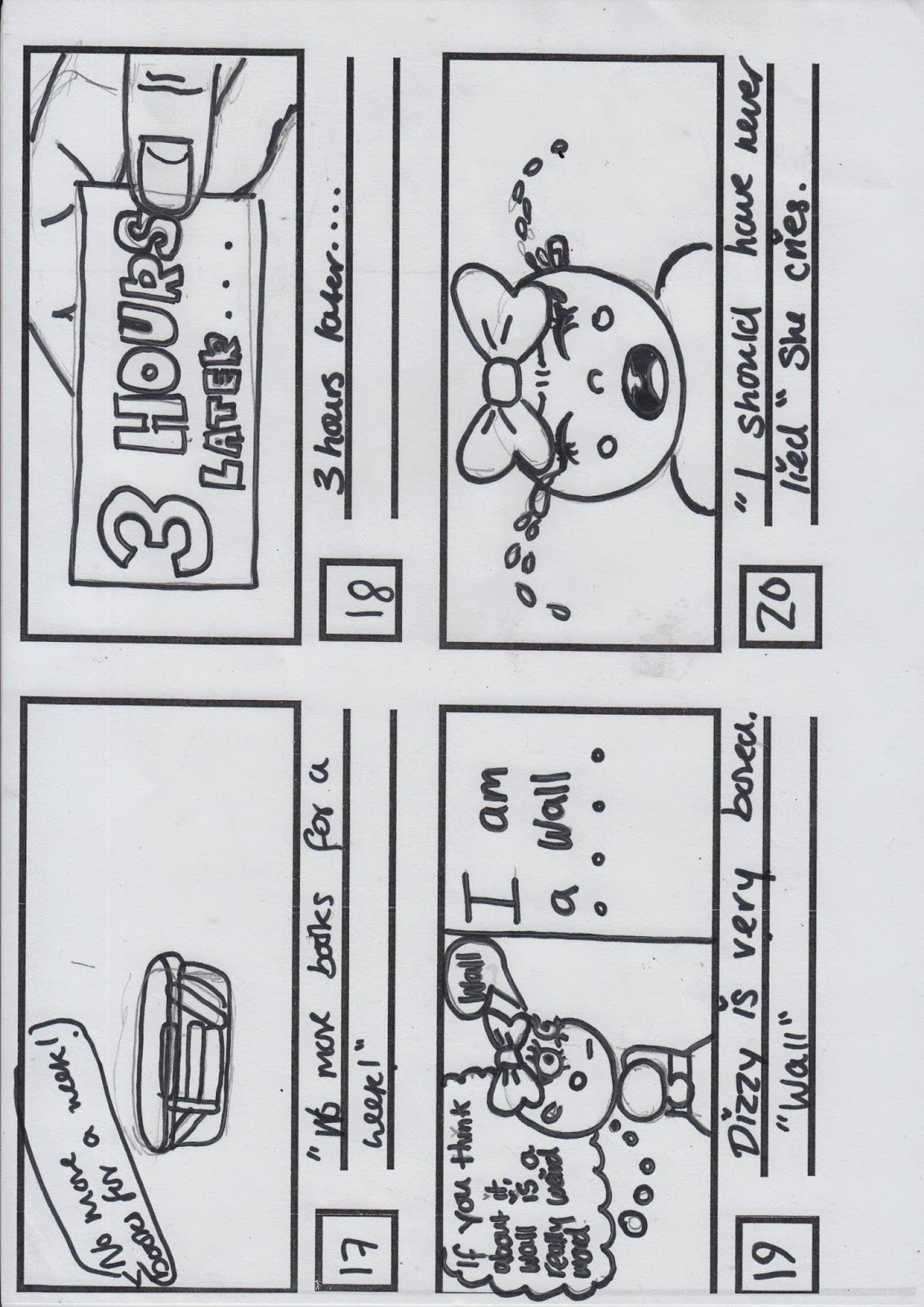
All these different shows and characters have helped me create my character and ideas for the tv programme that i will hopefully, successfully make. Peppa pig: This programme has helped me to discover my target audience and the genre of the tv programme (educational but fun for kids) Harry Potter: I have literally used this purely to pick up the vocabulary and voice acting i would like for my finished performance. South park: This has helped me design my character using large circular shapes and keeping the character extremely simple. It has also helped me create an idea of how i will film my program (stop motion) Rugrats: Helped me give an idea of a walking, talking, highly educated baby which learns lessons throughout everyday life by making mistakes and learning from them. Phineus and Ferb: Colours and simplicity has help me build an idea to what kids would like in the current time eara. Arthur: giving typical everyday sinarios and finding a way around them.


Typical viewer for my television programme
Target audience
 I want my target audience to relate with peppa pigs target audience. This is because Peppa Pig is a short episode with a meaning behind each screening, it always contains some sort of moral which kids at a young age should learn from. Although Peppa Pig is quite a naughty character which provokes children to be naughty 'But peppa pig does mummy' where as i want people to see my character Dizzy as naughty with making her mistakes but faces consequences which will make children not want to be naughty or encourage them to talk back to parents ect. The programme i am developing is actually more to encourage parents to show them that television can benefit their children and help their mannerisms. As a kid, i wasn't allowed to watch much tv as my mum would call it 'american trash' which was rude and clearly just for an entertaining purpose. I want mothers and fathers to see tv as an educational basis rather than a treat for their kids. For example: Peppa pig says 'yuk' to her vegetables and doesn't eat them, which almost shows children that eating vegetables is not 'cool' because peppa doesn't eat them. On the other hand Dizzy reads a book about a girl called lucy who lies (lying lucy) this encourages children to read books within the opening scene. She then lies a couple of times but does not get away with it (her mum gets angry and shouts, taking away her books which are a privilege to Dizzy) This shows to kids that lying is bad, and you will have consequences out of bad things which in this case is lying. I also want to make the programme colourful and pink! This will appeal to young girls as pink is a popular colour within the age market I am looking at. I also think that if i make the visuals as simple as possible, less attention will be drawn to the imagery but more to the morals and lessons within the show, simplicity is key for the younger age group; they'll still be entertained by the imagery but more focused on what that character does, how they act and the responsibilities and life lessons learnt. Realistically I want her to have a typical english family: Mother: Strict but caring and the child: naughty but by being punished lightly, improves her actions. I want her to be an only child so that all attention is drawn to that one character.
Perfect Viewer
Name: Emily
Age: 7 (and three quarters)
Average day: Emily likes to hop out of bed and be excited to learn all the spellings and maths equations at her day at primary. In her spare time she likes to go to read an educational book and tell her friends that she'll have time to play horses and gallop around the playground after school hours but during school she is the hard working top student all children should be. After all her lessons are over she's fairly upset but then her mood brightens by then being able to play that exciting game of horses on the playground with her friends. Emily is quite naughty when she gets home because obviously she's tired from all those hard spellings she had to complete. She refuses to eat her cabbage at the table so her mother switches on the tv and shows Emily how the character Dizzy eats them when her mums told her to. Emily then thinking this is completely satisfying and cool doesn't only eat her cabbage but she sweeps up everything on her plate, including the hated green beans! (because dizzy does) She then watches more of Dizzy after dinner until the clock strikes 7Oclock and prances up stairs with a scrub in the bath and then returns to bed to start an educational fun day all over again!
Hobbies and Interests: Emily loves baths (bubbles amuse her) ,Reading (maths books and science equations), she likes playing with her friends (after school hours of course) and attending book clubs or science fairs in her spare time and finally of course watching a lot of The dizzy show.
Spending power: Emily being at a young age cannot fund for herself so mummy helps pay for all the books and toys she can imagine with her dad sending a certain amount of money to her from where he lives just a while away.
Typical media consumption: Emily watches television before she attends a hard day at school and every day after her dinner. She doesn't regularly play video games but she is awaiting the 'Dizzy video game' to arise from the media world. She's very interested in book and loves how entertaining they are learning life lessons every day
Legal and Ethical
Copy right
Potential issues:
With the character that I have designed I used a basic structure of south park characters being very simple and rounded features. As you can see these two characters: my own 'Dizzy' and South Parks Kyle are fairly similar with the shapes that i have used. This can also be a potential threat to my tv programme that kids may have the idea of the tv show Dizzy having some sort of relevance to South park which is not the look I am going for.


Offensive material
With the age group I am aiming for I personally don't think there would be any issues. I have to thin carefully about what voice I choose for Dizzy so that she is not seen as a racist character. I would like to use stereotypes as a typical, posh english girl but I want the tv show to be as realistic as I possibly can so I will not use this, instead I will look at her realistically to give kids a true, non-false intake on situations. I would rate my tv programme a U/PG. Some may find the television show slightly offensive due to its harsh realistic intake, but some hopefully will find this more helpful than trying to get across to kids that everything will be fine and life is easy. As shown in this story board idea.
I personally think by being harsh but still realistic and true it will be beneficial to children of a young age and their parents as well. I'm trying to do something different to my programme rather than matching others in this current day because the character i am trying to portray is a harsh lesson that they will understand realistically but also learn in a fun way.
Representation
I would like Dizzy to be presented as a nice girl that makes mistakes like everyone does in life but has help resolving them or consequences from her actions. I will choose her voice carefully so that it is not racist/ discriminating and i will also make sure that the morals of each programme are clear so that the programme isn't showed in a bad way to viewers.


Thursday, 24 April 2014
.jpg)


Tuesday, 22 April 2014
Voice acting
My character is meant to be a baby. Although Dizzy looks like a baby, i want her voice to be sophisticated and smart so that children understand the show easier.
 I think that Emma Watson's voice would be perfect considering her voice is fairly high and very intellectual! I think that it would fit the characters image perfectly and show a good example to young children on mannerisms and how to speak because she is very pronunciated.

I also think that for the mother i want a deep voice like marge simpson from the simpsons. This is to give the impression that the voice and character is slightly humorous but is also stern and strict. This will give the kids an idea that it isn't like their mothers but she is also a mother figure. Also the viewers can make their imagination wonder about what the mother would look like according to the voice of the character.

I also think that for the mother i want a deep voice like marge simpson from the simpsons. This is to give the impression that the voice and character is slightly humorous but is also stern and strict. This will give the kids an idea that it isn't like their mothers but she is also a mother figure. Also the viewers can make their imagination wonder about what the mother would look like according to the voice of the character.
Tuesday, 15 April 2014
Final design

For my final design i have created the character dizzy as what looks like a baby. This will excite children to have a walking talking baby with a smart vocabulary. As you can see Dizzy is a very rounded character, she has a circular head and all of the features are rounded with no square/straight edges. I hope to portray this as her characters personality. I have used pink as her dress because its a very attractive colour for young girls which are likely to watch my television show. I also like how i have used the bow as her head piece instead of hair because it is a very popular accessory which again children of a young age would find appealing. I have dressed her in a frilly dress as a typical attraction to young ages and i have tried to relate the dress to sleeping beauty which is a very popular movie so that my show will attract the young ages which enjoy the movie. I have also made her very short which is the idea that the walking, talking baby is near enough realistic of course avoiding the fact that a baby without hair is talking and walking.
Tuesday, 1 April 2014
Expression sheet

Tuesday, 25 March 2014
Idea Sheets

Friday, 21 March 2014

Tuesday, 18 March 2014
Use of shapes in character design
Monsters inc-
 Mike Wozawski- This character has been designed in a circular way. The main part of his body is just a circular head bringing attention to the facial features which also includes a lot of circular shapes: eye, teeth, mouth ect. This also draws the attention to the fact that he's a soft character, friendly and bubbly.
Sully- This character has been designed very square to show that he has power, he's strong and 'scary' in the human world. But to add some friendliness to him they have covered him in fur which almost gives him soft edges on his square look.
Randal- This character gives off a triangular shape which shows that he's a sharp, edgy character. It also shows that his body is very slim and the way in which he moves draws attention to the fact that he almost creeps around.
Up
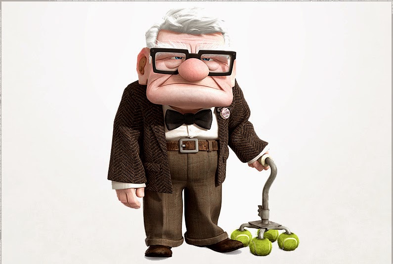 Mr Fredrickson is a very square character. His face has been made alot bigger than the rest if his body so that attention is drawn to his long, stern facial expression. Mr Fredrickson is a very grumpy character but he shows that he is in charge by his independence which is eggsadurate in his square shape and how the structure of his house is very square which emplies that he is stable. In terms of stability Mr Fredrickson is not, but the fact that he has a walking stick with tennis balls on the end could show that he needs something friendly and soft to keep his independence supported.
.jpeg) This picture shows Mr Fredrickson as a child. At this point, he is designed as a circular figure. This shows a small boy who loves adventure and is still independent which is shown by the way he moves. Everything within the little Mr Fredrickson is circular apart from his glasses which are hidden beneath his hat. This is because everything that the child see's as he gets older is all very serious and straight forward and he is almost forced to become independent.
This picture shows Mr Fredrickson as a child. At this point, he is designed as a circular figure. This shows a small boy who loves adventure and is still independent which is shown by the way he moves. Everything within the little Mr Fredrickson is circular apart from his glasses which are hidden beneath his hat. This is because everything that the child see's as he gets older is all very serious and straight forward and he is almost forced to become independent.
 As Mr Fredrickson spend their life together, his wife Ellie's face shape and character still stays circular which encourages the audience to think that throughout her life she stays soft, happy and helps drive the relationship which brings the idea of a wheel into the circular shape. Where as Mr Fredrickson becomes more square but still has an element of circle as he spends his life with Ellie. As soon as Ellie passes away, Mr Fredricksons smile is never there, there fore his face drops constantly frowning which exaggerates the square look on his face. This shows that he has become independent, without a partner and is forced to stand on his own. This also shows that his walking stick almost replaces Ellie to support him. Although My Fredrickson still has an element of softness about his face which his nose. This supports his glasses which he has worn throughout his life through everything, going back to the fact that his glasses see all seriousness and he would not be able to see without them which also insinuates his circular nose supports his vision.

The house from up is also very square which shows that it is supportive and steady. It also includes a triangular look about it which inputs the idea of it being edgy and sharp. This makes sense because their home contains alot of memories good and bad. This is completely forgotten when circular balloons are lifted from the chimney of the house and breaks away the house from its surroundings which could also resemble Mr Fredrickson letting go but also holding on to something that he loves (his home/wife) being supported by soft circular baloons.
 The house then carries on its adventure through the sky to eventually end up at the waterfall that him and his wife have been dreaming about. The waterfall is very trinagular shaped which is seen as sharp and disturbing but this can resemble that good and bad memories make an overall memory which can be seen in anyway that you like. Each element put together creates something positive which could relate to Mr Fredrickson being square, Ellie being circular and the home that they live in having all those elements including triangular. Putting the house in an environment that the two were always dreaming about shows that although it could be dangerous, they would give it a chance because of the amount they have been through together.
Sully- This character has been designed very square to show that he has power, he's strong and 'scary' in the human world. But to add some friendliness to him they have covered him in fur which almost gives him soft edges on his square look.
Randal- This character gives off a triangular shape which shows that he's a sharp, edgy character. It also shows that his body is very slim and the way in which he moves draws attention to the fact that he almost creeps around.
Up
This picture shows Mr Fredrickson as a child. At this point, he is designed as a circular figure. This shows a small boy who loves adventure and is still independent which is shown by the way he moves. Everything within the little Mr Fredrickson is circular apart from his glasses which are hidden beneath his hat. This is because everything that the child see's as he gets older is all very serious and straight forward and he is almost forced to become independent.As Mr Fredrickson spend their life together, his wife Ellie's face shape and character still stays circular which encourages the audience to think that throughout her life she stays soft, happy and helps drive the relationship which brings the idea of a wheel into the circular shape. Where as Mr Fredrickson becomes more square but still has an element of circle as he spends his life with Ellie. As soon as Ellie passes away, Mr Fredricksons smile is never there, there fore his face drops constantly frowning which exaggerates the square look on his face. This shows that he has become independent, without a partner and is forced to stand on his own. This also shows that his walking stick almost replaces Ellie to support him. Although My Fredrickson still has an element of softness about his face which his nose. This supports his glasses which he has worn throughout his life through everything, going back to the fact that his glasses see all seriousness and he would not be able to see without them which also insinuates his circular nose supports his vision.The house from up is also very square which shows that it is supportive and steady. It also includes a triangular look about it which inputs the idea of it being edgy and sharp. This makes sense because their home contains alot of memories good and bad. This is completely forgotten when circular balloons are lifted from the chimney of the house and breaks away the house from its surroundings which could also resemble Mr Fredrickson letting go but also holding on to something that he loves (his home/wife) being supported by soft circular baloons.
The house then carries on its adventure through the sky to eventually end up at the waterfall that him and his wife have been dreaming about. The waterfall is very trinagular shaped which is seen as sharp and disturbing but this can resemble that good and bad memories make an overall memory which can be seen in anyway that you like. Each element put together creates something positive which could relate to Mr Fredrickson being square, Ellie being circular and the home that they live in having all those elements including triangular. Putting the house in an environment that the two were always dreaming about shows that although it could be dangerous, they would give it a chance because of the amount they have been through together.

Character design
"Character design is the combination of physical traits and narrative"
- When creating a character the narrative of the character is used/shown by the chosen physical appearance which feeds the audience a basic idea of what the characters responsibilities and personality is like.
"The face is the primary channel to express emotion of a person" (Colman) This is why cartoon characters heads/faces are a lot larger than the rest of the body. (A bigger canvas to show emotion) A lot of a cartoon characters can be defined by the posture and body language. "Hands are an effective way in expressing personality. How a character carries their wight also informs us about personality- particularly which body part they lead with"
Chest- confidence, strength, hero's

Pelvis- lazy, laid back

Head- emplies intelligence

Knees- Cowardice
- When creating a character the narrative of the character is used/shown by the chosen physical appearance which feeds the audience a basic idea of what the characters responsibilities and personality is like.
"The face is the primary channel to express emotion of a person" (Colman) This is why cartoon characters heads/faces are a lot larger than the rest of the body. (A bigger canvas to show emotion) A lot of a cartoon characters can be defined by the posture and body language. "Hands are an effective way in expressing personality. How a character carries their wight also informs us about personality- particularly which body part they lead with"
Chest- confidence, strength, hero's
Pelvis- lazy, laid back
Head- emplies intelligence
Knees- Cowardice
Monday, 17 March 2014

Thursday, 13 March 2014
Animation product research
Despicable me

Despicable me is a very successful animation which was released in 2010 and created by Dreamworks. Dreamworks are an American animation studio based in Glendale, California that creates animated feature films, television programmes and online virtual worlds. They have released a total of 27 feature films including the franchises of Shrek, Kung fu panda, Monsters vs Aliens and How to train your Dragon.
The director of Despicable me was Pierre Coffin and Chris Renaud and the animation style that was used was computer graphics which worked well to interest the target audience of children but also encourages adults with its mature humour which is hinted throughout the film. The purpose of the animation used is to entertain the audience creating humorous characters and a serial, distorted world for the audience to enjoy because its different to their own and something that they've never seen before.
Personally what i like about the film the most is how they have created the minions in a sense that they are hard workers controlled by Gru (the main character) The way that Dreamworks have shown the minions image as little yellow people who look almost like mine workers because of the way that they have been stylised. I also like the idea of how each individual minion look the same but have an element to them which makes them their own person; one eye instead of two, height, width, hair/no hair ect. Their voices also fit the image very well including their vocabulary which is linked to a baby human. All together the minions make the movie and without them it wouldn't be as humorous or entertaining for the audience.
Mikes new car

Mikes new car is a short film created by Pixar animation studios which was released in 2002, directed by Pete Docter and Roger Gould. This short film was Pixars very first short to utilise vocal performances and the first to use characters and situations from their released previous work. Pixar have created many animation films such as Toy Story, Up, Monesters inc and many many more.
The animation style used of Mikes new car is also computer generated which hits its child friendly audience. The purpose of the animation is again purely to entertain the audience and help them believe in a different world to their own with a hint of realism that draws the audience' attention to a possibility of another world that human children are scared of all based on an idea of childrens fears of 'Theres a monster under my bed' or 'Theres something in my closet'.
Personally I like the idea that this short film is almost a saftey hazard for children about the dangers of cars. This successfully engages the target audience because they're two favourite characters from Monsters inc! It holds the childs attention so that they pay attention carefully without them even noticing that they're being taught a lesson by Sully and Mike.
The Simpsons

The simpsons is a very successful tv series which was produced by fox and is now the longest televised scripted show in history and has been running for over 20 years, it was directed by Matt Groeining. Fox is a global broadcasting company that has done many tv programmes over the years such as: Glee, Bones, American dad and many more. The animation style used is computer generated, starting with story boards being drawn for a rough idea of what the episodes would look like. Then they put together a rough black and white story board and then put it into the computer to show how the characters move and sound.
The target audience for this program was not like any other animated program. It was targeted for more adults because of the dark and rude humour used. Even though it is animated the idea of it being a cartoon was more to bring humour to the piece and not have any source of seriousness to the episodes. The voices are also used to mimic the typical stereo types of Lisa being an innocent know it all with a high pitched voice, Bart having a high annoying voice for the class clown/ rebel and Homer having a dopey voice for a typical drunken character/dad.
I personally like the simpsons because every time i watch it i can almost feel like i can relate to a certain character. Although the characters as a whole and the environment is realistic, the way that they have stylised the characters bring a humorous element to the episodes which makes the audience feel good about themselves and cant possibly be related to the characters because of the way they look.
ASDF movie

This series of 2-3 minute movies is a massive youtube hit that gained over millions of hits within the space of a month. Theres not a lot to say about this web series purely because it was an original idea by a group of students and posted it to youtube. It was uploaded to youtube on August 10th 2008, created by a username called Tomska.
The skit 'i got your nose' was the opening skit that was ever created. This first skit to this day now has over 38 million views. The animation type used is computer generated which works well because not a lot of movement is used but the voiceovers are the main element which helps the graphics to encourage humour. The target audience is mainly for teenagers and youtube lovers! The whole purpose to the asdf movie series is to entertain and make people laugh! Pure blunt humour fills the 2-3 minutes and is enjoyable for all ages and audiences.
Personally I like this web series because the humour is within short doses and then completely switches to a different scenario which makes the humour funnier rather than it all being on the same tone and becoming boring and non-origional.
Arctic Monkeys- Do I wanna know?
This music video was released on 9th september 2013. The band which made the song is named the Arctic monkeys. Although they did not physically create the music video, a lot of their input was made to fit the style in which they had in their head of animation and put it together with their song. The animation style has been thought about very clearly as it looks crisp and has no simple bit to the video.
The animation style is computer generated and personally i think that a lot of the graphics was created using photo shop software to then make the whole video clearly artistic which is the vibe in which the artists were going for to back up an original entertaining song. The target audience for this animation is for youtube fans and of course the fans of The Arctic Monkeys.
Personally I like how each part of the video fits and flows into each part of the animation. The fact that the whole clip is adjusted to the music beat and rhythm also makes the experience of watching it more enjoyable so you can see the different aspects move in different ways to fit the music.
Twinings Advert
This advert for twinings tea was a joint creation by two separate companies: Abbott Mead Vicors BBDO and Psyop LA. The first advert was released on television in 2011 and Twinings are still continuing to create the same image of animation to advertise their product. They use the same song for each advert but also include different journeys and use different elements of music to make the backing track seem different. Paul Brazier was one of the creative directors for this specific advert.
To create the advert they started to story board and sketch all of the ideas to the story. They then use a process called 'boardamatics' which is putting the story board ideas into the computer and slowly developing them to become more realistic and start to show a sense of flow to the piece. They then finally put it into 3d animation and start to colour correct and finalise the finished product.
I personally enjoy this advert because its so original and not seen before. The way that they have carefully picked out the audience (woman) and narrated a story within less than a minute shows a sense of creativity. I also enjoy how the animation is taken to the extent where the reason why they have used animation and not real people is so that the audience can put themselves into that mind set and relate to the concept.
''We've created this really quite extraordinary piece of animated advertising to metaphorically explain the hectic lives that women today lead, and how taking just 10 minutes out each day to reconnect with yourself can have such an impact on the rest of your day. Take a look, and let us know what you think.''
Subscribe to:
Comments (Atom)