
Tuesday, 25 March 2014
Idea Sheets
Friday, 21 March 2014

Tuesday, 18 March 2014
Use of shapes in character design
Monsters inc-
 Mike Wozawski- This character has been designed in a circular way. The main part of his body is just a circular head bringing attention to the facial features which also includes a lot of circular shapes: eye, teeth, mouth ect. This also draws the attention to the fact that he's a soft character, friendly and bubbly.
Sully- This character has been designed very square to show that he has power, he's strong and 'scary' in the human world. But to add some friendliness to him they have covered him in fur which almost gives him soft edges on his square look.
Randal- This character gives off a triangular shape which shows that he's a sharp, edgy character. It also shows that his body is very slim and the way in which he moves draws attention to the fact that he almost creeps around.
Up
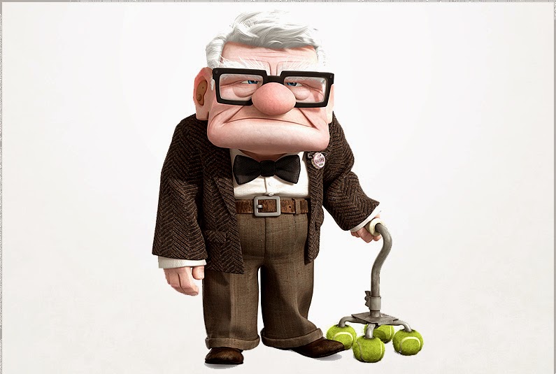 Mr Fredrickson is a very square character. His face has been made alot bigger than the rest if his body so that attention is drawn to his long, stern facial expression. Mr Fredrickson is a very grumpy character but he shows that he is in charge by his independence which is eggsadurate in his square shape and how the structure of his house is very square which emplies that he is stable. In terms of stability Mr Fredrickson is not, but the fact that he has a walking stick with tennis balls on the end could show that he needs something friendly and soft to keep his independence supported.
.jpeg) This picture shows Mr Fredrickson as a child. At this point, he is designed as a circular figure. This shows a small boy who loves adventure and is still independent which is shown by the way he moves. Everything within the little Mr Fredrickson is circular apart from his glasses which are hidden beneath his hat. This is because everything that the child see's as he gets older is all very serious and straight forward and he is almost forced to become independent.
This picture shows Mr Fredrickson as a child. At this point, he is designed as a circular figure. This shows a small boy who loves adventure and is still independent which is shown by the way he moves. Everything within the little Mr Fredrickson is circular apart from his glasses which are hidden beneath his hat. This is because everything that the child see's as he gets older is all very serious and straight forward and he is almost forced to become independent.
 As Mr Fredrickson spend their life together, his wife Ellie's face shape and character still stays circular which encourages the audience to think that throughout her life she stays soft, happy and helps drive the relationship which brings the idea of a wheel into the circular shape. Where as Mr Fredrickson becomes more square but still has an element of circle as he spends his life with Ellie. As soon as Ellie passes away, Mr Fredricksons smile is never there, there fore his face drops constantly frowning which exaggerates the square look on his face. This shows that he has become independent, without a partner and is forced to stand on his own. This also shows that his walking stick almost replaces Ellie to support him. Although My Fredrickson still has an element of softness about his face which his nose. This supports his glasses which he has worn throughout his life through everything, going back to the fact that his glasses see all seriousness and he would not be able to see without them which also insinuates his circular nose supports his vision.

The house from up is also very square which shows that it is supportive and steady. It also includes a triangular look about it which inputs the idea of it being edgy and sharp. This makes sense because their home contains alot of memories good and bad. This is completely forgotten when circular balloons are lifted from the chimney of the house and breaks away the house from its surroundings which could also resemble Mr Fredrickson letting go but also holding on to something that he loves (his home/wife) being supported by soft circular baloons.
 The house then carries on its adventure through the sky to eventually end up at the waterfall that him and his wife have been dreaming about. The waterfall is very trinagular shaped which is seen as sharp and disturbing but this can resemble that good and bad memories make an overall memory which can be seen in anyway that you like. Each element put together creates something positive which could relate to Mr Fredrickson being square, Ellie being circular and the home that they live in having all those elements including triangular. Putting the house in an environment that the two were always dreaming about shows that although it could be dangerous, they would give it a chance because of the amount they have been through together.
Sully- This character has been designed very square to show that he has power, he's strong and 'scary' in the human world. But to add some friendliness to him they have covered him in fur which almost gives him soft edges on his square look.
Randal- This character gives off a triangular shape which shows that he's a sharp, edgy character. It also shows that his body is very slim and the way in which he moves draws attention to the fact that he almost creeps around.
Up
This picture shows Mr Fredrickson as a child. At this point, he is designed as a circular figure. This shows a small boy who loves adventure and is still independent which is shown by the way he moves. Everything within the little Mr Fredrickson is circular apart from his glasses which are hidden beneath his hat. This is because everything that the child see's as he gets older is all very serious and straight forward and he is almost forced to become independent.As Mr Fredrickson spend their life together, his wife Ellie's face shape and character still stays circular which encourages the audience to think that throughout her life she stays soft, happy and helps drive the relationship which brings the idea of a wheel into the circular shape. Where as Mr Fredrickson becomes more square but still has an element of circle as he spends his life with Ellie. As soon as Ellie passes away, Mr Fredricksons smile is never there, there fore his face drops constantly frowning which exaggerates the square look on his face. This shows that he has become independent, without a partner and is forced to stand on his own. This also shows that his walking stick almost replaces Ellie to support him. Although My Fredrickson still has an element of softness about his face which his nose. This supports his glasses which he has worn throughout his life through everything, going back to the fact that his glasses see all seriousness and he would not be able to see without them which also insinuates his circular nose supports his vision.The house from up is also very square which shows that it is supportive and steady. It also includes a triangular look about it which inputs the idea of it being edgy and sharp. This makes sense because their home contains alot of memories good and bad. This is completely forgotten when circular balloons are lifted from the chimney of the house and breaks away the house from its surroundings which could also resemble Mr Fredrickson letting go but also holding on to something that he loves (his home/wife) being supported by soft circular baloons.
The house then carries on its adventure through the sky to eventually end up at the waterfall that him and his wife have been dreaming about. The waterfall is very trinagular shaped which is seen as sharp and disturbing but this can resemble that good and bad memories make an overall memory which can be seen in anyway that you like. Each element put together creates something positive which could relate to Mr Fredrickson being square, Ellie being circular and the home that they live in having all those elements including triangular. Putting the house in an environment that the two were always dreaming about shows that although it could be dangerous, they would give it a chance because of the amount they have been through together.

Character design
"Character design is the combination of physical traits and narrative"
- When creating a character the narrative of the character is used/shown by the chosen physical appearance which feeds the audience a basic idea of what the characters responsibilities and personality is like.
"The face is the primary channel to express emotion of a person" (Colman) This is why cartoon characters heads/faces are a lot larger than the rest of the body. (A bigger canvas to show emotion) A lot of a cartoon characters can be defined by the posture and body language. "Hands are an effective way in expressing personality. How a character carries their wight also informs us about personality- particularly which body part they lead with"
Chest- confidence, strength, hero's

Pelvis- lazy, laid back

Head- emplies intelligence

Knees- Cowardice
- When creating a character the narrative of the character is used/shown by the chosen physical appearance which feeds the audience a basic idea of what the characters responsibilities and personality is like.
"The face is the primary channel to express emotion of a person" (Colman) This is why cartoon characters heads/faces are a lot larger than the rest of the body. (A bigger canvas to show emotion) A lot of a cartoon characters can be defined by the posture and body language. "Hands are an effective way in expressing personality. How a character carries their wight also informs us about personality- particularly which body part they lead with"
Chest- confidence, strength, hero's
Pelvis- lazy, laid back
Head- emplies intelligence
Knees- Cowardice
Monday, 17 March 2014

Thursday, 13 March 2014
Animation product research
Despicable me

Despicable me is a very successful animation which was released in 2010 and created by Dreamworks. Dreamworks are an American animation studio based in Glendale, California that creates animated feature films, television programmes and online virtual worlds. They have released a total of 27 feature films including the franchises of Shrek, Kung fu panda, Monsters vs Aliens and How to train your Dragon.
The director of Despicable me was Pierre Coffin and Chris Renaud and the animation style that was used was computer graphics which worked well to interest the target audience of children but also encourages adults with its mature humour which is hinted throughout the film. The purpose of the animation used is to entertain the audience creating humorous characters and a serial, distorted world for the audience to enjoy because its different to their own and something that they've never seen before.
Personally what i like about the film the most is how they have created the minions in a sense that they are hard workers controlled by Gru (the main character) The way that Dreamworks have shown the minions image as little yellow people who look almost like mine workers because of the way that they have been stylised. I also like the idea of how each individual minion look the same but have an element to them which makes them their own person; one eye instead of two, height, width, hair/no hair ect. Their voices also fit the image very well including their vocabulary which is linked to a baby human. All together the minions make the movie and without them it wouldn't be as humorous or entertaining for the audience.
Mikes new car

Mikes new car is a short film created by Pixar animation studios which was released in 2002, directed by Pete Docter and Roger Gould. This short film was Pixars very first short to utilise vocal performances and the first to use characters and situations from their released previous work. Pixar have created many animation films such as Toy Story, Up, Monesters inc and many many more.
The animation style used of Mikes new car is also computer generated which hits its child friendly audience. The purpose of the animation is again purely to entertain the audience and help them believe in a different world to their own with a hint of realism that draws the audience' attention to a possibility of another world that human children are scared of all based on an idea of childrens fears of 'Theres a monster under my bed' or 'Theres something in my closet'.
Personally I like the idea that this short film is almost a saftey hazard for children about the dangers of cars. This successfully engages the target audience because they're two favourite characters from Monsters inc! It holds the childs attention so that they pay attention carefully without them even noticing that they're being taught a lesson by Sully and Mike.
The Simpsons

The simpsons is a very successful tv series which was produced by fox and is now the longest televised scripted show in history and has been running for over 20 years, it was directed by Matt Groeining. Fox is a global broadcasting company that has done many tv programmes over the years such as: Glee, Bones, American dad and many more. The animation style used is computer generated, starting with story boards being drawn for a rough idea of what the episodes would look like. Then they put together a rough black and white story board and then put it into the computer to show how the characters move and sound.
The target audience for this program was not like any other animated program. It was targeted for more adults because of the dark and rude humour used. Even though it is animated the idea of it being a cartoon was more to bring humour to the piece and not have any source of seriousness to the episodes. The voices are also used to mimic the typical stereo types of Lisa being an innocent know it all with a high pitched voice, Bart having a high annoying voice for the class clown/ rebel and Homer having a dopey voice for a typical drunken character/dad.
I personally like the simpsons because every time i watch it i can almost feel like i can relate to a certain character. Although the characters as a whole and the environment is realistic, the way that they have stylised the characters bring a humorous element to the episodes which makes the audience feel good about themselves and cant possibly be related to the characters because of the way they look.
ASDF movie

This series of 2-3 minute movies is a massive youtube hit that gained over millions of hits within the space of a month. Theres not a lot to say about this web series purely because it was an original idea by a group of students and posted it to youtube. It was uploaded to youtube on August 10th 2008, created by a username called Tomska.
The skit 'i got your nose' was the opening skit that was ever created. This first skit to this day now has over 38 million views. The animation type used is computer generated which works well because not a lot of movement is used but the voiceovers are the main element which helps the graphics to encourage humour. The target audience is mainly for teenagers and youtube lovers! The whole purpose to the asdf movie series is to entertain and make people laugh! Pure blunt humour fills the 2-3 minutes and is enjoyable for all ages and audiences.
Personally I like this web series because the humour is within short doses and then completely switches to a different scenario which makes the humour funnier rather than it all being on the same tone and becoming boring and non-origional.
Arctic Monkeys- Do I wanna know?
This music video was released on 9th september 2013. The band which made the song is named the Arctic monkeys. Although they did not physically create the music video, a lot of their input was made to fit the style in which they had in their head of animation and put it together with their song. The animation style has been thought about very clearly as it looks crisp and has no simple bit to the video.
The animation style is computer generated and personally i think that a lot of the graphics was created using photo shop software to then make the whole video clearly artistic which is the vibe in which the artists were going for to back up an original entertaining song. The target audience for this animation is for youtube fans and of course the fans of The Arctic Monkeys.
Personally I like how each part of the video fits and flows into each part of the animation. The fact that the whole clip is adjusted to the music beat and rhythm also makes the experience of watching it more enjoyable so you can see the different aspects move in different ways to fit the music.
Twinings Advert
This advert for twinings tea was a joint creation by two separate companies: Abbott Mead Vicors BBDO and Psyop LA. The first advert was released on television in 2011 and Twinings are still continuing to create the same image of animation to advertise their product. They use the same song for each advert but also include different journeys and use different elements of music to make the backing track seem different. Paul Brazier was one of the creative directors for this specific advert.
To create the advert they started to story board and sketch all of the ideas to the story. They then use a process called 'boardamatics' which is putting the story board ideas into the computer and slowly developing them to become more realistic and start to show a sense of flow to the piece. They then finally put it into 3d animation and start to colour correct and finalise the finished product.
I personally enjoy this advert because its so original and not seen before. The way that they have carefully picked out the audience (woman) and narrated a story within less than a minute shows a sense of creativity. I also enjoy how the animation is taken to the extent where the reason why they have used animation and not real people is so that the audience can put themselves into that mind set and relate to the concept.
''We've created this really quite extraordinary piece of animated advertising to metaphorically explain the hectic lives that women today lead, and how taking just 10 minutes out each day to reconnect with yourself can have such an impact on the rest of your day. Take a look, and let us know what you think.''
Bear Movement

Monday, 10 March 2014
Pixar research
Pixar is a very successful company world wide that has created many well known animated feature and short films for over 25 years dating back to 1979. The main people who founded pixar was: Ed Catmull, Alvy Ray Smith and Steve Jobs. The studios for pixar is located in Emeryville, California.


That year Pixar opened its initial public offering on November the 28th which was then rated the largest IPO of the year. Walt disney and Pixar then agreed to work together so that the companies could work together to create an overall, more successful outcome. They agreed to produce 5 movies over the next 10 years to come. They continued working together and produced highly successful films which are now rated some of the best animated/computed generated animation movies created of all time. The movies that were produced by the working teams were: A bugs life (1998), Toy Story 2 (1999), For the birds (2000), Monsters inc (2001), Finding nemo (2003), The incredibles (2004), Cars (2006), Ratatouille (2007) and many more.
The process that pixar goes through to create a successful movie
The whole process of creating an animated movie takes place with just one simple idea which becomes a different idea in everyones heads for a team to finally develop on so that everyone in the process is happy with an overall outcome. 'The process is a group pf people trying to get into the directors head and trying to bring his/her vision to life' (Randy Barett, character designer, set designer and matte painter) It all starts with a vision that gets put into pictures by an artist which tries to make the image as believable as possible. They do this by using clocks within the piece giving the target audience a believable idea to work with and relate with. Theres then a sculpting process where those visions from the drawings are formed into a 3D idea so that they can figure out how the characters move, how their expression is portrayed and how the architecture is made believable. This process is then joined by a director, a computer genius and costume designers who all work together to eventually create a good idea and outcome on how everything works together. This is then put into a computer and made into a moving animation which eventually turns into a finished animated movie.

Tuesday, 4 March 2014
Rotoscoping

Subscribe to:
Posts (Atom)